- Design Presentation Boards

Presentation Board Content
Consistency in presentation boards.
- Presentation Boards should all be the same size and orientation (landscape/portrait)
- Common colour scheme
- Same font size, colour and style for titles and lables
- Same Layout/ Grid patern of content
- Consistent style and size of images
- Common Logo/Insignia on each board
Presentation Board Titles & Labels
Grid layout in presentation boards, "reading" a presentation board, left to right or center outward reading order in presentation boards, top -> down reading order in presentation boards, presentation board weighting, framing images in a presentation board, stand back from the presentation board.

Free Design Stuff Ad
Popular Topics

Featured post
What's the best ecommerce platform.

Most Read Articles

Blog Archive
- ► December (6)
- ► November (6)
- ► October (15)
- ► September (13)
- ► August (11)
- ► July (27)
- ► June (26)
- ► May (46)
- ► April (52)
- ► March (28)
- ► February (18)
- ► January (9)
- ► December (9)
- ► November (17)
- ► October (20)
- ► September (7)
- ► August (14)
- ► July (11)
- ► June (11)
- ► May (12)
- ► April (9)
- ► March (17)
- ► February (8)
- ► December (7)
- ► November (12)
- ► October (30)
- ► September (22)
- ► August (16)
- ► July (4)
- ► June (8)
- ► May (2)
- ► April (7)
- ► March (3)
- ► February (5)
- ► January (2)
- ► December (3)
- ► October (4)
- ► September (4)
- ► August (7)
- ► July (10)
- ► June (4)
- ► May (10)
- ► April (8)
- ► February (9)
- ► January (4)
- ► November (7)
- ► October (5)
- ► September (3)
- ► August (3)
- ► July (1)
- ► January (1)
- ► November (3)
- ► September (1)
- ► August (1)
- ► June (3)
- ► March (11)
- ► November (1)
- ► October (1)
- ► August (2)
- ► June (2)
- ► April (3)
- ► March (1)
- ► February (4)
- ► January (3)
- ► December (2)
- ► November (4)
- ► June (1)
- ► February (1)
- ► December (1)
- ► August (9)
- ► July (2)
- ► May (11)
- ► April (5)
- ► March (36)
- SEO For Images
- Interior Design Styles at a Glance
- Magazine Cover Design Features
- The Most Powerful Words In The English Language
- Create a Cartoon Character
- Top Advertising Techniques In Graphic Design
- White Space In Graphic Design
- Elements of Design
- The Meaning of Shapes
- A Brief History Of The Computer Games Industry
- Want To Be An Interior Designer?
- Interior Design Drawing Techniques
- Interior Design Room Layout Tips
- Interior Design Materials & Finishes
- Interior Design Process
- Furniture Joinery
- Furniture Materials
- Furniture Design Careers
- Furniture Design Process
- Get The Right Paper Size For Your Design
- Want A Career In The Games Industry?
- How To Review A Computer Game
- Games Design Team
- UE4 Start Screen UI
- UE4 Enemy Characters & Animations
- UE4 Enemy AI
- UE4 Custom Static Meshes
- UE4 Pickups
- UE4 BSP & Geometry
- UE4 Custom Textures & Materials
- ► January (18)
- ► November (8)
- ► March (35)
- ► October (3)
- ► September (2)
How to make your presentation board stand out? 5 simple tips to improve your architecture panels
Adequate creating and composing architecture panels is a key to a successful project delivery, a final presentation, or an awarded competition entry. It is an important part of designing process and very often it stands a synthesis of your long-term work. So, you supposed to take into consideration many aspects during creating your boards. In this article we would like to present five simple tips and advice that will help make your presentation boards stand out. If you follow rules below, your panels will grab attention of the jury panel. The tips will get you closer to a good result in architecture competitions or university public presentations.
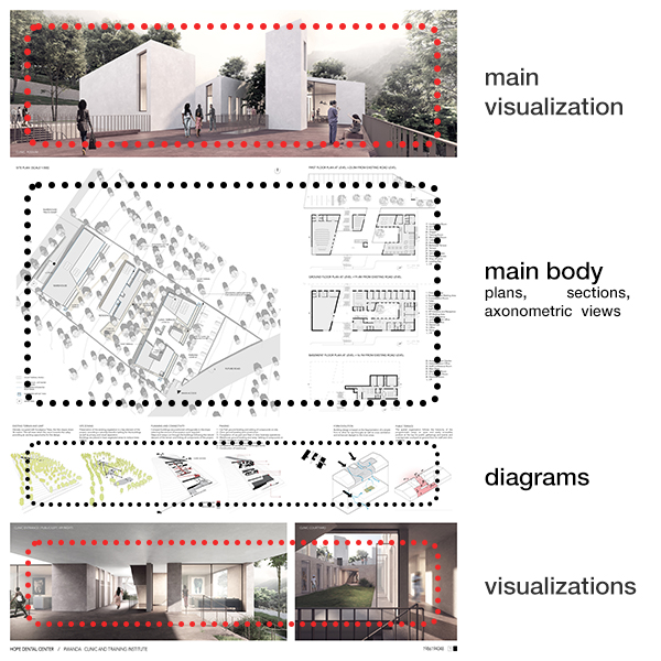
1. Make it simple
You probably have heard that many times before. Make it simple. But why? Why my presentation boards should be simple when my design is so complex? If the project is complex for you, it will seem to be even more complicated and demanding for the jury made of your lecturer or colleagues. So, we, as architects, use presentation boards to show others our design in the clearest and most readable way, to present our ideas shortly and the most communicatively. Thera are some tricks that you can use to simplify your panels. Firstly, you may divide your drawing into sections. There may be diagrams put in one sector, technical drawings, details, axonometric views, or perspectives in others. Plans look the best when they directly correspond with the sections or elevations. It is also a good solution to divide your panels horizontally or vertically – to make a composition with your drawings.
2. Show the clue
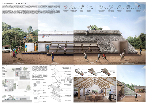
It is very important to show the key aspects of your work. When you have a final presentation during your studies, you may have a chance to express your design perfectly but when you participate in an architecture competition there is no opportunity to clarify your designing decisions. Your drawing and panels speak for you, so the leading idea and the concept behind the submission should be easily readable. You may use contrast colors to emphasize the most essential parts. Diagrams expressing the form-finding process, explaining circulation among the area, or functional sketches may be found very useful and make your design understandable. It is also important to show the most characteristics spaces on the perspectives – the ones that make the character of the whole area.
3. Quality, not quantity
You need to be aware that it is easy to recognize if you put a lot of effort into drawing and postproduction or not. The visualizations, plans, sections, axonometric views are supposed to be developed on a similar level. It is better to exclude some drawings from the board than put a lot of pictures in bad quality or even worse – unfinished. Make sure that every drawing on the final panels is the best you can prepare. Remember that you use those drawings to show your skills and predispositions.
4. Importance of 3d views
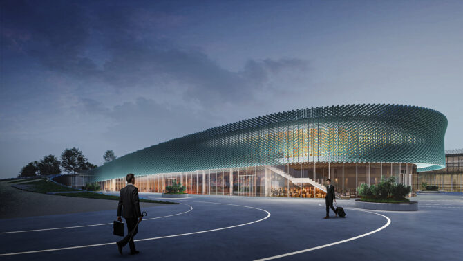
Axonometric views are the best drawings to show the voluminosity and special relations between the elements. You can use exploded axonometry to better explain what is happening inside the building. Using this type of drawing it is also possible to present how the designed structure works as well as show the construction and finishing layers. When it comes to perspectives, they could express the character and the atmosphere of the place in the best way. You may make the 3d model on a similar level as the rest of the drawings but when you pick the shots and positions of the camera, make sure that in those places your model is prepared with more details. There is no need to waste your time on preparing 3d details that will not be even visible on 1:200 or 1:500 scale.
5. Title and description
It would be nice if you could make up a title that is easy to remember and emphasize your approach to the design in the most effective way. If you make a catchy title, you will stay in the jury’s minds longer and have greater chances of being awarded. Moreover, make it visible. All texts and descriptions should be readable, so please put them in the appropriate to the boards’ format sizes and do not use the flourishing fonts. Be certain that your design has all the necessary description, but do not go too far and try not to overtalk your design.
We hope that these tips will get you closer to the awards! Good luck in your future challenges!
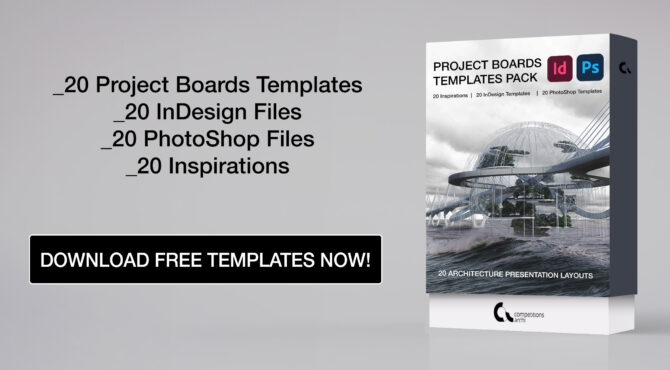
If you need more inspirations, check 20 Free Project Boards Templates prepared by competitions.archi and collaborators. It is a set of 20 awarded project boards available in Photoshop and InDesign formats.
Most popular competitions

People also viewed


How to create successful architecture presentation boards
In architectural design, the ability to communicate your vision effectively is as crucial as the design itself.
Architecture presentation boards are essential for this type of communication. These boards provide a visual and textual representation of your architectural solutions that is easy for your clients to understand.
Want some ideas for creating more effective architecture presentation boards?
In this 7-minute read, we’ll delve into the art of crafting presentation boards that not only convey your design intent but do so in a manner that captivates and convinces your audience.
So whether you’re a seasoned architect or a new contractor working on your first project, the tips in this article will help elevate your presentation skills and land you more clients.
Let’s start with a quick look at the basics.
What is an Architecture Presentation Board?
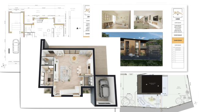
An architecture presentation board is a visual tool used by architects and designers to convey the concepts, details and essence of their architectural projects. It combines images, drawings, text, and sometimes physical materials, to provide a coherent and appealing overview of a project.
These boards are pivotal in architectural competitions and client presentations since they serve as a bridge between the architect’s vision and the client’s understanding.
But presentation boards should be more than just a random collection of visuals.
- Use your board to tell a story and guide the viewer through the project’s inception, development, and final design.
- Effective boards balance aesthetics with information by employing a strategic layout to highlight key elements and facilitate easy comprehension.
- Presentation boards can vary in format from digital displays to large printed panels.
Check out the next section to see the 8 steps to creating your presentation board.
How to Develop Architectural Presentation Boards
Developing architectural presentation boards that stand out requires a blend of creativity, strategic planning, and technical skills. Here’s a step-by-step guide to crafting boards that showcase your project and impress potential clients.
1. Size & Orientation
The size and orientation of your presentation board are foundational decisions that set the stage for the rest of the board’s design.
Size: Consider the amount of content and the level of detail you wish to present. Larger boards can accommodate more information and are suitable for complex projects but require careful organization to avoid overwhelming the viewer. Standard sizes often range from A3 for smaller projects to A0 for more detailed presentations.
Orientation: The choice between landscape and portrait orientation can influence the flow of your presentation. Landscape is preferred for its width which facilitates a natural, left-to-right reading flow. It’s ideal for showcasing panoramic site views or extensive floor plans.
PRO TIP :
- Always tailor the size and orientation to the context of your presentation. For intimate settings, a smaller board might be more practical since it allows for closer viewing and discussion.
The layout of your board is critical in guiding the viewer’s eye through your presentation. This ensures they focus on key elements without missing important details.
Balance and Flow: Create a layout that balances visual elements, text, and white space. Start with the most impactful images or drawings positioned centrally or towards the top, where they attract immediate attention. Use text sparingly to complement the visuals rather than overwhelm them.
Hierarchy: Establish a visual hierarchy that leads the viewer through your board logically, from the project overview to specific details. Use different sizes and styles of text and images to denote importance.
- Use grids to align elements. This creates a professional appearance and makes your board more readable.
- Consider color blocks or frames to delineate different sections without cluttering the board with too many lines.
DON’T FORGET:
- Keep a consistent margin around the edge of the board. This ‘frame’ ensures that none of your content is lost if the board is mounted or encased.
3. Structure
The structure of your presentation board is about more than just where things are placed. It’s about creating a coherent flow that guides the viewer through your design.
Organizational Strategy : Start with a clear organizational structure, such as chronological, thematic or by the project phase. This helps in making your presentation logical and digestible.
Connectivity: Ensure there is a clear connection between different elements on your board. Use lines, arrows or even a numbered path to indicate the order in which the content should be viewed.
PRO TIP:
- Incorporate an “Introduction” and “Conclusion” section on your board. An introduction at the top left can set the stage for your presentation. Then, a conclusion at the bottom right summarizes the project outcomes or next steps.
DON’T FORGET:
- The viewer’s eye naturally moves from left to right and top to bottom. Place your most important information (like the project title or key visuals) where viewers will likely see it first.
4. Background
The background of your architecture presentation board plays a crucial role in setting the tone and making your content stand out.
Simplicity is Key: Opt for a simple, non-distracting background that enhances the readability of your content. A subtle gradient or a light texture can add depth without overpowering the visuals and text.
Contrast: Ensure there is enough contrast between the background and the content to make everything easily readable. Light backgrounds with dark text and visuals usually work best.
PRO TIP:
- Experiment with soft, architectural textures as backgrounds to add a thematic touch to your board without overwhelming the main content.
DON’T FORGET:
- Always preview your board in its final form before printing or presenting. What looks good on a computer screen may not translate well to a large format print or display.
Colors can evoke emotions, highlight important information, and organize your board visually.
Color Scheme: Choose a color scheme that complements your project. Use your project’s primary colors, or select a palette that reflects the project’s mood and context. Consistency in color usage across the board ties the presentation together.
Accent Colors: Use accent colors sparingly to draw attention to key areas or important details. This can be an effective way to guide the viewer’s eye through the board.
- A limited color palette (2-3 main colors) can help in maintaining visual coherence and professionalism.
- Consider the psychological impact of colors. For example, blue can convey trust and stability, while green might be used to emphasize sustainability or environmental aspects.
6. Visual Ranking
Visual ranking on your presentation board ensures that key elements capture immediate attention and then guide the viewer through your design story.
Prioritize Content: Decide what elements of your design are most important and deserve the prime real estate on your board. Typically, this includes your main concept image, and key plans or sections.
Size Matters: Larger images attract more attention. Use size strategically to emphasize the most critical aspects of your project. Smaller images can show less important, but still relevant, information.
- Use visual contrast through varied textures or color highlights to elevate important content further. A high-contrast backdrop for your most crucial images or diagrams can make them stand out.
7. Image Selection
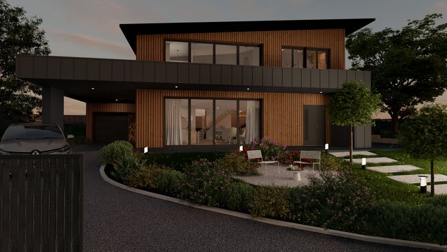
The images you choose to display on your architecture presentation board can make or break your presentation.
Quality Over Quantity: Select high-resolution images that clearly communicate your design. Blurry or pixelated images can detract from your professionalism.
Relevance is Key: Every image should serve a purpose, whether it’s to showcase design details, illustrate spatial relationships or convey the atmosphere of your proposed project.
PRO TIP: If you plan to use 3D-generated images, make sure they are high-quality. Poor-quality, unrealistic images can detract from your design presentation. That’s why more and more housing professionals are switching to easy-to-use 3D design software like Cedreo . Cedreo makes it easy for anyone to generate photorealistic 3D project images for architecture presentation boards.
8. Text & Font
The text and font choices on your presentation board are vital for communicating your design intent clearly and effectively.
Legibility is Crucial: Choose fonts that are easy to read at various sizes. Sans-serif fonts are often preferred for their clean lines and readability in both digital and print formats.
Hierarchy Through Typography: Use different font sizes and weights to create a visual hierarchy in your text. It should be easy for viewers to distinguish between titles, headings and body text.
- Limit your presentation to two fonts to maintain visual coherence—one for headings and one for body text. This simplifies the design and enhances readability.
Types of Architecture Presentation Boards
Understanding the different architecture presentation board templates and layouts is essential for selecting the most effective way to communicate your project’s vision. Each type serves a unique purpose and audience, from conceptual designs to detailed technical drawings.
Here are a few architecture presentation board examples.
Conceptual Board
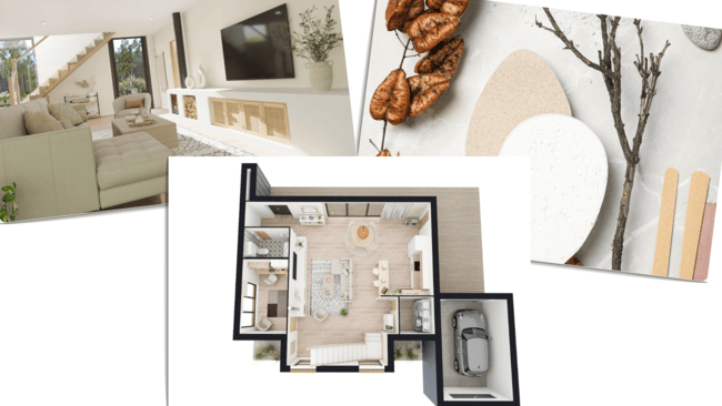
Conceptual boards are the storytellers of architectural design. They focus on the vision, ideas, and themes behind a project. They are less about detail and more about conveying the concept and atmosphere of the design.
- Use compelling visuals that evoke the intended feel of the project, such as mood boards, abstract diagrams, and 3D floor plans .
- Include brief text descriptions or quotes that capture the essence of your design philosophy and the main concept behind the project.
Advice: Conceptual boards are your chance to connect emotionally with your audience, so choose images and words that resonate deeply with the project’s core idea. Remember: The goal is to intrigue and inspire while making viewers curious and excited about the potential of your design.
Technical Drawings Board
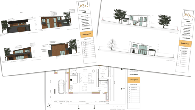
Technical drawing boards detail the specificities of the design through precise drawings and specifications.
- Incorporate a range of technical drawings, including floor plans , elevations , sections , and detailed construction drawings , to provide a comprehensive overview of the project.
- Use annotations, dimensions, and notes to clarify the technical aspects and innovative solutions within your design.
Advice: Make sure your technical boards are meticulously organized and labeled to ensure clarity and ease of understanding. Remember: While technical accuracy is important, consider the layout and visual appeal of your board to ensure it remains engaging and not overly dense.
Professional Board
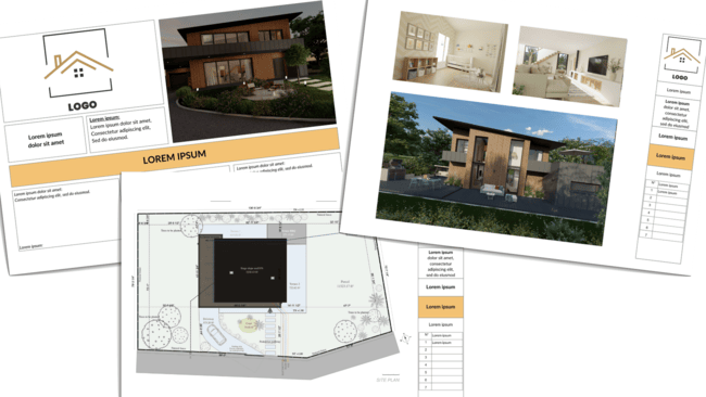
Professional boards are tailored for client presentations, competitions, or public exhibitions. They blend both conceptual and technical elements to present a complete story.
- Combine striking visuals, key technical drawings, and succinct, persuasive text to showcase your project’s strengths and feasibility.
- Balance the layout to highlight the most compelling aspects of your design while ensuring a logical flow that guides the viewer through the narrative.
Advice : Professional boards are your portfolio’s highlight reel. Focus on quality over quantity and make sure to select only the most impactful images and information that demonstrates your vision.
Remember : Take the time to get it right. A well-executed professional board is a powerful tool for winning bids, gaining approval, and impressing stakeholders.
Get Designing with Cedreo Today!
Crafting an architecture presentation board that effectively communicates your vision and details can be a daunting task.
Whether you’re creating a simple conceptual board for a small project or a detailed technical board for a custom home, Cedreo empowers you to make the best boards as fast as possible.
- Rapid Visualization: Cedreo lets you quickly transform your ideas into visual concepts, with easy-to-use features that save you loads of time and effort.
- One-Stop Solution: From initial sketches to final presentation boards, Cedreo offers a comprehensive platform for all your design needs.
- High-Quality Outputs : Produce professional, high-resolution 3D presentation board images that impress clients and showcase your projects in the best light.
Get started with Cedreo now (there’s a FREE version !) and take your architectural presentations to the next level.
Take Your Designs to the Next Level with Cedreo
The Average Bedroom Size? Here’s What’s Best for Your Designs
Best Kitchen Design Software (free & Paid) for 2025
The Best Architecture Podcasts You Should Listen To

IMAGES
VIDEO